Introduction to Reporting
Fullcast provides powerful reporting tools, specifically geared toward the needs of the go-to-market strategy and operations functions. This article gives an introduction to the types of data and charts you can create and share in Fullcast.
IN THIS ARTICLE
Why Use Reporting in Fullcast
One of the biggest advantages of viewing your go-to-market data in Fullcast is that it allows you to view data broken down according to the way you go to market. As you click through territories, the data will refresh for each particular segment.
Data Sources and Types
To understand the potential of data analysis in Fullcast, it's important to know where the data is coming from and what types of data you can access.
Data Sources
What are all the potential sources of data that you can leverage through Fullcast’s charts and reports?
- Raw Entities - data that is created outside of Fullcast. The most common Raw Entities are CRM data, but you can also leverage other sources of data.
- Go-to-Market Entities - data that is created within Fullcast, such as Territories, Assignments, Targets, and Custom Metrics
📋For more information on importing entities into Fullcast, refer to the article Creating a New Entity in Fullcast
Data Types
The Basic and GTM chart types organize data according to the entity, object, then dimensions and measures.
- Dimensions - typically text data
- Measures - numeric data
Chart and Report Types
Fullcast allows you to bring data together for analysis in various ways.
Summary Metrics
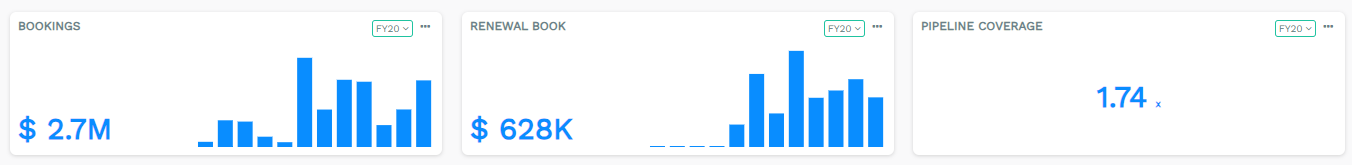
Summary Metrics are calculated fields that leverage both GTM entities and Raw entities. These are constructed based on your own needs to reflect specific key performance indicators (KPIs) that your organization tracks. Some common Summary Metrics include number of accounts, ARR, and Bookings Potential.
📋For additional information on Summary Metrics, refer to the articles Summary Metrics and Add Metrics to the Summary Panel
Charts
Charts provide a lot of flexibility to bring together the data you need to answer specific questions. You can build robust graphs or tables and customize them to meet your needs. When choosing a graph presentation, you can select which axis each dimension or measure is on, time periods, and more. You can also choose to view the data in a table.

Reports
Reports are geared to a more specific strategic task, which is indicated in the name. They have fewer inputs and provide a bit more guidance on what they can do.

📋For more details and visual examples of each type of Report and Chart, refer to the article: Understanding Different Types of Reports
📋For how-to documentation, see the articles How to Build Reports and Managing Charts
Overview of Chart and Report Types
| Type | Description | Example and Additional Documentation |
| Basic Chart | Allows you to build charts using all the Raw Entities (e.g. Salesforce Data) and the GTM Entity of the Plan you are in (e.g. in a Territory plan, you can report on territories.) |
Number of accounts by industry in each territory 📋How-to documentation: How to Use Basic Charts |
| GTM Chart | Allows you to build charts using the all the GTM Entities and the CRM object that is relevant to the Plan that you are in. That is, in a Territory Plan you can report on the Account object and in a Team Plan, you can report on the People object. |
Open pipe by territory 📋 How-to documentation: GTM Charts |
| Attainment Chart | Allows you to build a chart showing Targets and how far people are from achieving them. |
AE quota attainment by Quarter 📋How-to documentation forthcoming |
| Comparison Chart | Allows you to compare the same metric across select territories. |
Number of tier A accounts in a given territory vs any other territory 📋How-to documentation: forthcoming |
| Data Quality Chart | Allows you to understand at a glance what the state of your data is. |
Completeness of zip code data 📋How-to documentation: forthcoming |
|
Map Chart |
Allows you to display fields, values, and metrics overlaid on a map. |
Heatmap of Number of Tier A accounts across all the US sales territories 📋How-to documentation: Map Charts |
| Coverage Report |
Allows you to view coverage across territories. Example who is the AE for each territory in a segment. |
Table of AEs by Territory 📋How-to documentation: Coverage Reporting |
| Portfolio Report | Allows you to view an individual’s portfolio of accounts. |
Table with Columns for Territory, AE Name, Account Name, Tier, Bookings Potential 📋How-to documentation: Create a Portfolio Report |
| Disruption Report | Allows you to view how proposed changes would impact key metrics. You can view the current state, the proposed changes, and the difference between the current and proposed. | 📋How-to documentation: Disruption Reports |
Accessing Reports and Dashboards
There are a couple different places to view reports in Fullcast. While the Motion Module allows you to access all of our charts and report types and pin them to Dashboards, the Design Module also provides important reporting capabilities.
In the Reports Module
The primary place for viewing data for analysis is in the Reports Module. Here you can create Dashboards that bring together all the variety of Charts, Reports, and Summary Metrics available in Fullcast.
📋 For how-to documentation, refer to the articles
- Create and Manage Dashboards
- Save Charts to Dashboards
- Edit Charts in a Dashboard
- Pin Metrics to a Dashboard
- Organizing Folders for Dashboards
In the Territories Module
In the Territories Module, you can use the Balancer tab to create GTM charts specifically geared toward viewing and tweaking the balance of territories during the territory planning process. Additionally, you can pin Summary Metrics to your view in the Territory Designer.

📋For additional information on Summary Metrics, refer to the articles Summary Metrics and Add Metrics to the Summary Panel
📋For additional information on the Balancer Tab, refer to the article Configure Reporting in the Balancer Tab