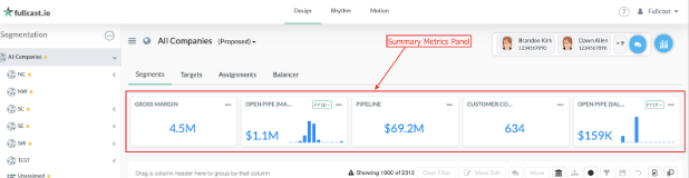
Summary Metrics
Metrics serve as a quantifiable measure to monitor and evaluate the performance of specific business areas, playing a crucial role in the planning process by enabling the creation of measurable, fair, and achievable sales plans.
The Summary Metrics Panel provides users with easy access to useful metrics as they navigate the platform.
To learn how to construct your key metric, refer to the Metrics Settings article.
What are the features of the metric panel?
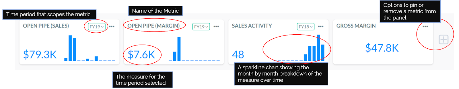
Each metric in the panel has a few components displayed:
- Metric name
- Time period (e.g., sales in Fiscal Year 2024)
- Total measure, displaying the actual metric value for the selected time period
- For time-series metrics, a sparkline chart illustrating the metric’s progress month by month through the specified time period.
When a target is denied for a displayed metric, the panel also indicates progress toward meeting these goals.
The Summary Metrics Panel reflects:
- The hierarchy node is selected in the left panel, with metrics refreshing as you change nodes
- The chosen view (Current, Proposed, or Difference), with metrics updating accordingly
- The selected time period (e.g., 2019 or 2018)
- Associated targets and performance against those targets, are visible only for the duration the target is specified.
Identifying different types of metrics:
- Scalar metrics are denoted by a blue numerical value.
- Time-series metrics feature a dynamic bar graph illustrating metric breakdown over time. Hovering over each time period reveals associated variances and actual values.
Metric colors denote:
- Red indicates calculated variances
- Green represents actual values
- Grey indicates future targets.